nba球员python
In basketball, we typically talk about 5 positions: point guard, shooting guard, small forward, power forward, and center. Based on this, one might expect NBA players to fall into 5 distinct groups- Point guards perform similar to other point guards, shooting guards perform similar to other shooting guards, etc. Is this the case? Do NBA players fall neatly into position groups?
在篮球比赛中,我们通常谈论5个位置:控球后卫,得分后卫,小前锋,大前锋和中锋。 基于此,人们可能会期望NBA球员分为5个不同的组:控球后卫的表现与其他控球后卫相似,得分后卫的表现与其他得分后卫相似,等等。 NBA球员会整齐地属于位置组吗?
To answer this question, I will look at how NBA players “group” together. For example, there might be a group of players who collect lots of rebounds, shoot poorly from behind the 3 point line, and block lots of shots. I might call these players forwards. If we allow player performance to create groups, what will these groups look like?
为了回答这个问题,我将研究NBA球员如何“分组”在一起。 例如,可能有一群球员收集很多篮板,在3分线后投篮不佳,并且盖帽很多。 我可能会叫这些球员前锋。 如果我们允许玩家表演来创建组,那么这些组会是什么样?
To group players, I will use k-means clustering (https://en.wikipedia.org/wiki/K-means_clustering).
为了对玩家进行分组,我将使用k-means聚类( https://en.wikipedia.org/wiki/K-means_clustering )。
When choosing a clustering algorithm, its important to think about how the clustering algorithm defines clusters. k-means minimizes the distance between data points (players in my case) and the center of K different points. Because distance is between the cluster center and a given point, k-means assumes clusters are spherical. When thinking about clusters of NBA players, do I think these clusters will be spherical? If not, then I might want try a different clustering algorithm.
选择聚类算法时,考虑聚类算法如何定义聚类很重要。 k均值可最小化数据点(在我的情况下为玩家)与K个不同点的中心之间的距离。 由于距离在聚类中心和给定点之间,因此k均值假设聚类是球形的。 在考虑NBA球员群体时,我认为这些群体将是球形的吗? 如果没有,那么我可能想尝试其他聚类算法。
For now, I will assume generally spherical clusters and use k-means. At the end of this post, I will comment on whether this assumption seems valid.
现在,我将假设总体上为球形簇,并使用k均值。 在这篇文章的结尾,我将评论这个假设是否有效。
|
We need data. Collecting the data will require a couple steps. First, I will create a matrix of all players who ever played in the NBA (via the NBA.com API).
我们需要数据。 收集数据将需要几个步骤。 首先,我将创建一个所有曾在NBA比赛的球员的矩阵(通过NBA.com API)。
|
In the 1979-1980 season, the NBA started using the 3-point line. The 3-point has dramatically changed basketball, so players performed different before it. While this change in play was not instantaneous, it does not make sense to include players before the 3-point line.
在1979-1980赛季,NBA开始使用三分线。 3分制极大地改变了篮球,因此球员在此之前的表现有所不同。 尽管这种变化不是立即发生的,但在三分线之前加入球员没有任何意义。
|
I have a list of all the players after 1979, but I want data about all these players. When grouping the players, I am not interested in how much a player played. Instead, I want to know HOW a player played. To remove variability associated with playing time, I will gather data that is standardized for 36 minutes of play. For example, if a player averages 4 points and 12 minutes a game, this player averages 12 points per 36 minutes.
我有1979年以后所有球员的名单,但是我想要有关所有这些球员的数据。 在对球员分组时,我对球员的出场次数不感兴趣。 相反,我想知道玩家的表现。 为了消除与比赛时间相关的可变性,我将收集36分钟比赛中标准化的数据。 例如,如果一个玩家平均每场比赛获得4分12分钟,则该玩家每36分钟平均获得12分。
Below, I have written a function that will collect every player’s performance per 36 minutes. The function collects data one player at a time, so its VERY slow. If you want the data, it can be found on my github (https://github.com/dvatterott/nba_project).
在下面,我编写了一个函数,该函数将每36分钟收集一次每个玩家的表现。 该功能一次只能收集一个玩家的数据,因此其速度非常慢。 如果需要数据,可以在我的github( https://github.com/dvatterott/nba_project )上找到。
|
|
Index([u'PLAYER_ID', u'LEAGUE_ID', u'TEAM_ID', u'GP', u'GS', u'MIN', u'FGM', u'FGA', u'FG_PCT', u'FG3M', u'FG3A', u'FG3_PCT', u'FTM', u'FTA', u'FT_PCT', u'OREB', u'DREB', u'REB', u'AST', u'STL', u'BLK', u'TOV', u'PF', u'PTS'], dtype='object')Index([u'PLAYER_ID', u'LEAGUE_ID', u'TEAM_ID', u'GP', u'GS', u'MIN', u'FGM', u'FGA', u'FG_PCT', u'FG3M', u'FG3A', u'FG3_PCT', u'FTM', u'FTA', u'FT_PCT', u'OREB', u'DREB', u'REB', u'AST', u'STL', u'BLK', u'TOV', u'PF', u'PTS'], dtype='object')
Great! Now we have data that is scaled for 36 minutes of play (per36 data) from every player between 1979 and 2016. Above, I printed out the columns. I don’t want all this data. For instance, I do not care about how many minutes a player played. Also, some of the data is redundant. For instance, if I know a player’s field goal attempts (FGA) and field goal percentage (FG_PCT), I can calculate the number of made field goals (FGM). I removed the data columns that seem redundant. I do this because I do not want redundant data exercising too much influence on the grouping process.
大! 现在,我们拥有的数据在1979年至2016年之间可以扩展到每位玩家36分钟的比赛(per36数据)。在上面,我打印了列。 我不想要所有这些数据。 例如,我不在乎玩家玩了多少分钟。 另外,某些数据是冗余的。 例如,如果我知道一个球员的射门得分尝试(FGA)和射门得分百分比(FG_PCT),那么我可以计算出射门得分的数量(FGM)。 我删除了似乎多余的数据列。 我这样做是因为我不希望冗余数据对分组过程产生太大影响。
Below, I create new data columns for 2 point field goal attempts and 2 point field goal percentage. I also remove all players who played less than 50 games. I do this because these players have not had the opportunity to establish consistent performance.
在下面,我将为2分目标得分和2分目标百分比创建新的数据列。 我还将删除所有玩过少于50场比赛的玩家。 我这样做是因为这些参与者没有机会建立一致的表现。
|
It’s always important to visualize the data, so lets get an idea what we’re working with!
可视化数据始终很重要,因此让我们了解一下我们正在使用的数据!
The plot below is called a scatter matrix. This type of plot will appear again, so lets go through it carefully. Each subplot has the feature (stat) labeled on its row which serves as its y-axis. The column feature serves as the x-axis. For example the subplot in the second column of the first row plots 3-point field goal attempts by 3-point field goal percentage. As you can see, players that have higher 3-point percentages tend to take more 3-pointers… makes sense.
下面的图称为散布矩阵。 这种情节将再次出现,因此请仔细检查它。 每个子图的行上都标记了特征(统计),作为其y轴。 列特征用作x轴。 例如,第一行第二列中的子图以3点投篮命中百分比绘制3点投篮尝试。 如您所见,拥有较高三分球的球员往往会拿出更多的三分球……这是有道理的。
On the diagonals, I plot the Kernel Density Estimation for the sample histogram. More players fall into areas where where the line is higher on the y-axis. For instance, no players shoot better than ~45% from behind the 3 point line.
在对角线上,我绘制了样本直方图的内核密度估计。 更多玩家进入y轴上的线更高的区域。 例如,没有球员在三分线后的投篮命中率超过〜45%。
One interesting part about scatter matrices is the plots below the diagonal are a reflection of the plots above the diagonal. For example, the data in the second column of the first row and the first column of the second row are the same. The only difference is the axes have switched.
关于散布矩阵的一个有趣的部分是对角线以下的图是对角线上方的图的反映。 例如,第一行的第二列和第二行的第一列中的数据相同。 唯一的区别是轴已切换。
|
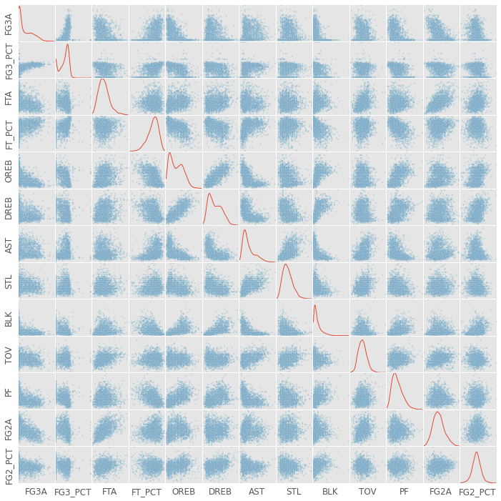
There are a couple things to note in the graph above. First, there’s a TON of information there. Second, it looks like there are some strong correlations. For example, look at the subplots depicting offensive rebounds by defensive rebounds.
上图中需要注意几件事。 首先,那里有大量信息。 其次,似乎存在一些强相关性。 例如,查看通过防守篮板描述进攻篮板的子图。
While I tried to throw out redundant data, I clearly did not throw out all redundant data. For example, players that are good 3-point shooters are probably also good free throw shooters. These players are simply good shooters, and being a good shooter contributes to multiple data columns above.
当我尝试抛出冗余数据时,我显然没有抛出所有冗余数据。 例如,优秀的三分球手也可能是优秀的罚球手。 这些球员只是好射手,而成为好射手则有助于上面的多个数据列。
When I group the data, I do not want an ability such as shooting to contribute too much. I want to group players equally according to all their abilities. Below I use a PCA to seperate variance associated with the different “components” (e.g., shooting ability) of basketball performance.
当我对数据进行分组时,我不希望诸如射击之类的功能做出太多贡献。 我想根据所有能力将球员平均分配。 下面,我使用PCA来区分与篮球表现的不同“组成部分”(例如投篮能力)相关的差异。
For an explanation of PCA I recommend this link – https://georgemdallas.wordpress.com/2013/10/30/principal-component-analysis-4-dummies-eigenvectors-eigenvalues-and-dimension-reduction/.
对于PCA的解释,我建议使用此链接– https://georgemdallas.wordpress.com/2013/10/30/principal-component-analysis-4-dummies-eigenvectors-eigenvalues-and-dimension-reduction/。
|
On the left, I plot the amount of variance explained after including each additional PCA component. Using all the components explains all the variability, but notice how little the last few components contribute. It doesn’t make sense to include a component that only explains 1% of the variability…but how many components to include!?
在左侧,我绘制了包括每个其他PCA组件之后说明的方差量。 使用所有组件可以解释所有可变性,但请注意最后几个组件的贡献很少。 包含仅解释1%变异性的组件是没有意义的……但是要包含多少个组件!
I chose to include the first 5 components because no component after the 5th explained more than 5% of the data. This part of the analysis is admittedly arbitrary, but 5% is a relatively conservative cut-off.
我之所以选择包括前5个组成部分,是因为第5个之后的任何组成部分都不能解释超过5%的数据。 诚然,这部分分析是任意的,但5%是相对保守的临界值。
Below is the fun part of the data. We get to look at what features contribute to the different principle components.
以下是数据的有趣部分。 我们来看看哪些功能对不同的主要原理有所贡献。
- Assists and 3-point shooting contribute to the first component. I will call this the Outside Skills component.
- Free throw attempts, assists, turnovers and 2-point field goals contribute to the second component. I will call this the Rim Scoring component.
- Free throw percentage and 2-point field goal percentage contribute to the third component. I will call this the Pure Points component.
- 2-point field goal percentage and steals contribute to the fourth component. I will call this the Defensive Big Man component.
- 3-point shooting and free throws contribute to the fifth component. I will call this the Dead Eye component.
- 助攻和三分球命中率是第一要素。 我将其称为“ 外部技能”部分。
- 罚球,助攻,失误和2分投篮得分是第二要素。 我将其称为Rim Scoring组件。
- 罚球率和2分投篮命中率构成第三部分。 我将其称为“ 纯积分”组件。
- 2分投篮命中率和抢断是第四要素。 我将其称为“ 防御大人物”组件。
- 三分球和罚球是第五要素。 我将其称为“ 死眼”组件。
One thing to keep in mind here is that each component explains less variance than the last. So while 3 point shooting contributes to both the 1st and 5th component, more 3 point shooting variability is probably explained by the 1st component.
这里要记住的一件事是,每个组件所解释的差异都小于最后一个。 因此,尽管三点射击对第一和第五部分都有贡献,但第一点可能解释了更多的三点射击变异性。
It would be great if we had a PCA component that was only shooting and another that was only rebounding since we typically conceive these to be different skills. Yet, there are multiple aspects of each skill. For example, a 3-point shooter not only has to be a dead-eye shooter, but also has to find ways to get open. Additionally, being good at “getting open” might be something akin to basketball IQ which would also contribute to assists and steals!
如果我们拥有仅用于射击的PCA组件而仅用于反弹的PCA组件,那将是很好的,因为我们通常认为这些是不同的技能。 但是,每种技能都有多个方面。 例如,一个三点射手不仅必须是死眼射手,而且还必须找到打开自己的方法。 另外,擅长“开放”可能类似于篮球智商,这也有助于助攻和抢断!
|
Cool, we have our 5 PCA components. Now lets transform the data into our 5 component PCA space (from our 13 feature space – e.g., FG3A, FG3_PCT, ect.). To do this, we give each player a score on each of the 5 PCA components.
太酷了,我们有5个PCA组件。 现在让我们将数据转换为5个组成部分的PCA空间(来自13个特征空间-例如FG3A,FG3_PCT等)。 为此,我们给每位玩家5个PCA组件中的每个得分。
Next, I want to see how players cluster together based on their scores on these components. First, let’s investigate how using more or less clusters (i.e., groups) explains different amounts of variance.
接下来,我想看看玩家是如何根据他们在这些组件上的得分聚集在一起的。 首先,让我们研究一下如何使用更多或更少的群集(即组)来解释不同数量的方差。
|
As you can in the left hand plot, adding more clusters explains more of the variance, but there are diminishing returns. Each additional cluster explains a little less data than the last (much like each PCA component explained less variance than the previous component).
就像您在左图中可以看到的那样,添加更多的聚类可以解释更多的方差,但是收益递减。 每个附加群集比最后一个群集解释的数据要少一些(很像每个PCA组件所解释的差异都比前一个组件少)。
The particularly intersting point here is the point where the second derivative is greatest, when the amount of change changes the most (the elbow). The elbow occurs at the 6th cluster.
此处特别的交点是变化量变化最大(弯头)时二阶导数最大的点。 肘部出现在第6组。
Perhaps not coincidently, 6 clusters also has the highest silhouette score (right hand plot). The silhouette score computes the average distance between a player and all other players in this player’s cluster. It then divides this distance by the distance between this player and all players in the next nearest cluster. Silhouette scores range between -1 and 1 (where negative one means the player is in the wrong cluster, 0 means the clusters completely overlap, and 1 means the clusters are extermely well separated).
也许并非巧合,六个聚类也具有最高的轮廓分数(右图)。 轮廓分数计算玩家与该玩家集群中所有其他玩家之间的平均距离。 然后,将这个距离除以该玩家与下一个最近群集中所有玩家之间的距离。 轮廓分数在-1和1之间(负1表示玩家位于错误的群集中,0表示群集完全重叠,而1则表示群集之间的间隔良好)。
Six clusters has the highest silhouette score at 0.19. 0.19 is not great, and suggests a different clustering algorithm might be better. More on this later.
六个群集的轮廓得分最高,为0.19。 0.19不好,表明使用不同的聚类算法可能更好。 稍后再详细介绍。
Because 6 clusters is the elbow and has the highest silhouette score, I will use 6 clusters in my grouping analysis. Okay, now that I decided on 6 clusters lets see what players fall into what clusters!
因为6个聚类是肘部,并且轮廓分数最高,所以在分组分析中将使用6个聚类。 好吧,现在我决定对6个集群进行分类,让我们看看哪些玩家属于哪个集群!
|
Awesome. Now lets see how all the clusters look. These clusters were created in 5 dimensional space, which is not easy to visualize. Below I plot another scatter matrix. The scatter matrix allows us to visualize the clusters in different 2D combinations of the 5D space.
太棒了 现在,让我们看看所有群集的外观。 这些簇是在5维空间中创建的,这不容易可视化。 在下面,我绘制了另一个散布矩阵。 散布矩阵使我们能够以5D空间的不同2D组合可视化群集。
|
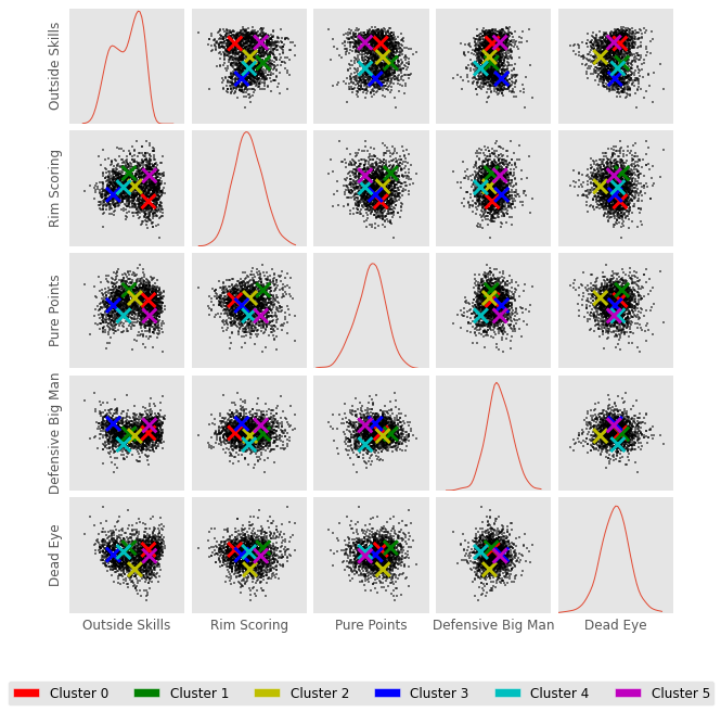
In this plot above. I mark the center of a given cluster with an X. For example, Cluster 0 and Cluster 5 are both high in outside skills. Cluster 5 is also high in rim scoring, but low in pure points.
在上面的情节中。 我用X标记给定群集的中心。例如,群集0和群集5的外部技能都很高。 类别5的篮圈得分也很高,但纯分数却很低。
Below I look at the players in each cluster. The first thing I do is identify the player closest to the cluster’s center. I call this player the prototype. It is the player that most exemplifies a cluster.
下面我看每个集群中的参与者。 我要做的第一件事是确定离集群中心最近的玩家。 我称这个玩家为原型。 最能说明集群的是玩家。
I then show a picture of this player because… well I wanted to see who these players were. I print out this player’s stats and the cluster’s centroid location. Finally, I print out the first ten players in this cluster. This is the first ten players alphabetically. Not the ten players closest to cluster center.
然后,我给这位球员展示照片,因为……好吧,我想看看这些球员是谁。 我打印出该玩家的统计数据和集群的质心位置。 最后,我打印出该集群中的前十名玩家。 按字母顺序排列,这是前十名玩家。 不是最接近集群中心的十个玩家。
|
| Outside Skills | 外在技能 | Rim Scoring | 轮滑得分 | Pure Points | 纯积分 | Defensive Big Man | 防守大个子 | Dead Eye | 死眼 | ||||||||
|---|---|---|---|---|---|---|---|---|---|---|---|---|---|---|---|---|---|
| 0.830457 | 0.830457 | -0.930833 | -0.930833 | 0.28203 | 0.28203 | -0.054093 | -0.054093 | 0.43606 | 0.43606 |
First, let me mention that cluster number is a purely categorical variable. Not ordinal. If you run this analysis, you will likely create clusters with similar players, but in a different order. For example, your cluster 1 might be my cluster 0.
首先,让我说一下集群号是一个纯粹的分类变量。 不连续。 如果运行此分析,则可能会创建具有相似参与者但顺序不同的集群。 例如,您的集群1可能是我的集群0。
Cluster 0 has the most players (25%; about 490 of the 1965 in this cluster analysis) and is red in the scatter matrix above.
聚类0的参与者最多(25%;在此聚类分析中为1965年的490%),并且在上方的散点图中为红色。
Cluster 0 players are second highest in outside shooting (in the table above you can see their average score on the outside skills component is 0.83). These players are lowest in rim scoring (-0.93), so they do not draw many fouls – they are basically the snipers from the outside.
类别0的玩家在外部射击中排名第二(在上表中,您在外部技能部分的平均得分为0.83)。 这些球员的篮下得分最低(-0.93),因此他们没有犯规很多-他们基本上是外界的狙击手。
The prototype is Lloyd Daniels who takes a fair number of 3s. I wouldn’t call 31% a dominant 3-point percentage, but its certainly not bad. Notably, Lloyd Daniels doesn’t seem to do much but shoot threes, as 55% of his shots come from the great beyond.
原型是劳埃德·丹尼尔斯(Lloyd Daniels),他需要3分之多的时间。 我不会说31%是占优势的三分百分比,但它的确不错。 值得一提的是,劳埃德·丹尼尔斯(Lloyd Daniels)似乎并没有做多,而是投三分,因为他55%的投篮命中率来自于超凡脱俗。
Cluster 0 notable players include Andrea Bargnani, JJ Barea, Danilo Gallinari, and Brandon Jennings. Some forwards. Some Guards. Mostly good shooters.
类别0的著名球员包括Andrea Bargnani,JJ Barea,Danilo Gallinari和Brandon Jennings。 一些前锋。 一些警卫。 主要是优秀的射手。
On to Cluster 1… I probably should have made a function from this code, but I enjoyed picking the players pictures too much.
在集群1上……我可能应该从这段代码中创建一个函数,但是我非常喜欢挑选玩家照片。
|
| Outside Skills | 外在技能 | Rim Scoring | 轮滑得分 | Pure Points | 纯积分 | Defensive Big Man | 防守大个子 | Dead Eye | 死眼 | ||||||||
|---|---|---|---|---|---|---|---|---|---|---|---|---|---|---|---|---|---|
| -0.340177 | -0.340177 | 1.008111 | 1.008111 | 1.051622 | 1.051622 | -0.150204 | -0.150204 | 0.599516 | 0.599516 |
1 Abdul-Jabbar, Kareem 4 Abdur-Rahim, Shareef 9 Adams, Alvan 18 Aguirre, Mark 75 Antetokounmpo, Giannis 77 Anthony, Carmelo 85 Arenas, Gilbert 121 Baker, Vin 133 Barkley, Charles 148 Bates, Billyray Name: Name, dtype: object1 Abdul-Jabbar, Kareem 4 Abdur-Rahim, Shareef 9 Adams, Alvan 18 Aguirre, Mark 75 Antetokounmpo, Giannis 77 Anthony, Carmelo 85 Arenas, Gilbert 121 Baker, Vin 133 Barkley, Charles 148 Bates, Billyray Name: Name, dtype: object
Cluster 1 is green in the scatter matrix and includes about 14% of players.
群集1在散布矩阵中为绿色,包含约14%的玩家。
Cluster 1 is highest on the rim scoring, pure points, and Dead Eye components. These players get the ball in the hoop.
类别1在轮辋得分,纯分和“死眼”组件上最高。 这些球员将球踢进篮筐。
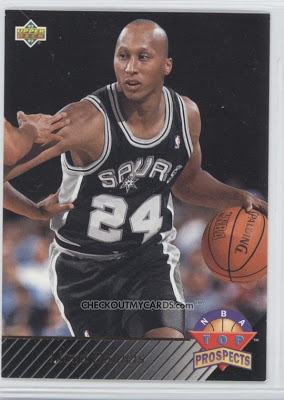
Christian Laettner is the prototype. He’s a solid scoring forward.
Christian Laettner是原型。 他是一个可靠的得分手。
Gilbert Arenas stands out in the first ten names as I was tempted to think of this cluster as big men, but it really seems to be players who shoot, score, and draw fouls.
吉尔伯特·阿里纳斯(Gilbert Arenas)在前十名中脱颖而出,因为我很想把这个集群视为大个子,但实际上似乎是那些能够投篮,得分和犯规的球员。
Cluster 1 Notable players include James Harden,Kevin Garnet, Kevin Durant, Tim Duncan, Kobe, Lebron, Kevin Martin, Shaq, Anthony Randolph??, Kevin Love, Derrick Rose, and Michael Jordan.
第一组的著名球员包括詹姆斯·哈登,凯文·加内特,凯文·杜randint,蒂姆·邓肯,科比,勒布朗,凯文·马丁,沙克,安东尼·兰道夫,凯文·洛夫,德里克·罗斯和迈克尔·乔丹。
|
| Outside Skills | 外在技能 | Rim Scoring | 轮滑得分 | Pure Points | 纯积分 | Defensive Big Man | 防守大个子 | Dead Eye | 死眼 | ||||||||
|---|---|---|---|---|---|---|---|---|---|---|---|---|---|---|---|---|---|
| 0.013618 | 0.013618 | 0.101054 | 0.101054 | 0.445377 | 0.445377 | -0.347974 | -0.347974 | -1.257634 | -1.257634 |
Cluster 2 is yellow in the scatter matrix and includes about 17% of players.
第2类在散布矩阵中为黄色,包含约17%的玩家。
Lots of big men who are not outside shooters and don’t draw many fouls. These players are strong 2 point shooters and free throw shooters. I think of these players as mid-range shooters. Many of the more recent Cluster 2 players are forwards since mid-range guards do not have much of a place in the current NBA.
很多大个子不在射手之外,也不会犯规。 这些球员是强力的2分射手和罚球手。 我认为这些球员是中距离射手。 由于中距离后卫在当前NBA中没有太多位置,因此许多最近的Cluster 2球员都是前锋。
Cluster 2’s prototype is Doug West. Doug West shoots well from the free throw line and on 2-point attempts, but not the 3-point line. He does not draw many fouls or collect many rebounds.
Cluster 2的原型是Doug West。 道格·韦斯特(Doug West)在罚球线和2分球尝试中投篮不错,但3分球却没有。 他没有犯规很多,也没有得到很多篮板。
Cluster 2 noteable players include LaMarcus Aldridge, Tayshaun Prince, Thaddeus Young, and Shaun Livingston
第2组值得注意的参与者包括LaMarcus Aldridge,Tayshaun Prince,Thaddeus Young和Shaun Livingston
|
| Outside Skills | 外在技能 | Rim Scoring | 轮滑得分 | Pure Points | 纯积分 | Defensive Big Man | 防守大个子 | Dead Eye | 死眼 | ||||||||
|---|---|---|---|---|---|---|---|---|---|---|---|---|---|---|---|---|---|
| -1.28655 | -1.28655 | -0.467105 | -0.467105 | -0.133546 | -0.133546 | 0.905368 | 0.905368 | 0.000679 | 0.000679 |
7 Acres, Mark 8 Acy, Quincy 13 Adams, Steven 15 Adrien, Jeff 21 Ajinca, Alexis 26 Aldrich, Cole 34 Alexander, Victor 45 Alston, Derrick 51 Amundson, Lou 52 Andersen, Chris Name: Name, dtype: object7 Acres, Mark 8 Acy, Quincy 13 Adams, Steven 15 Adrien, Jeff 21 Ajinca, Alexis 26 Aldrich, Cole 34 Alexander, Victor 45 Alston, Derrick 51 Amundson, Lou 52 Andersen, Chris Name: Name, dtype: object
Cluster 3 is blue in the scatter matrix and includes about 16% of players.
群集3在分散矩阵中为蓝色,包含约16%的玩家。
Cluster 3 players do not have outside skills such as assists and 3-point shooting (they’re last in outside skills). They do not draw many fouls or shoot well from the free throw line. These players do not shoot often, but have a decent shooting percentage. This is likely because they only shoot when wide open next to the hoop.
第3类玩家没有助攻和3分投篮等外部技能(他们在外部技能上排名倒数)。 他们在罚球线上没有很多犯规或投篮不佳。 这些球员不经常投篮,但是投篮命中率很高。 这可能是因为它们仅在箍紧敞开时才射击。
Cluster 3 players are highest on the defensive big man component. They block lots of shots and collect lots of rebounds.
第三组的球员在防守大个子方面最高。 他们挡住了很多投篮,收集了很多篮板。
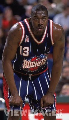
The Cluster 3 prototype is Kelvin Cato. Cato is not and outside shooter and he only averages 7.5 shots per 36, but he makes these shots at a decent clip. Cato averages about 10 rebounds per 36.
Cluster 3原型是Kelvin Cato。 卡托不是外线投篮手,他每36次只能投篮7.5次,但他的投篮命中率相当不错。 卡托平均每36篮板可得到10个篮板。
Notable Cluster 3 players include Andrew Bogut, Tyson Chandler, Andre Drummond, Kawahi Leonard??, Dikembe Mutumbo, and Hassan Whiteside.
著名的第3类玩家包括Andrew Bogut,Tyson Chandler,Andre Drummond,Kawahi Leonard ??,Dikembe Mutumbo和Hassan Whiteside。
|
| Outside Skills | 外在技能 | Rim Scoring | 轮滑得分 | Pure Points | 纯积分 | Defensive Big Man | 防守大个子 | Dead Eye | 死眼 | ||||||||
|---|---|---|---|---|---|---|---|---|---|---|---|---|---|---|---|---|---|
| -0.668445 | -0.668445 | 0.035927 | 0.035927 | -0.917479 | -0.917479 | -1.243347 | -1.243347 | 0.244897 | 0.244897 |
Cluster 4 is cyan in the scatter matrix above and includes the least number of players (about 13%).
簇4在上面的散射矩阵中是青色的,并且包含最少数量的玩家(大约13%)。
Cluster 4 players are not high on outsize skills. They are average on rim scoring. They do not score many points, and they don’t fill up the defensive side of the stat sheet. These players don’t seem like all stars.
第4类玩家的技巧不高。 他们在篮筐得分上平均。 他们得分不高,也没有填补统计表的防守端。 这些球员似乎并非全明星。
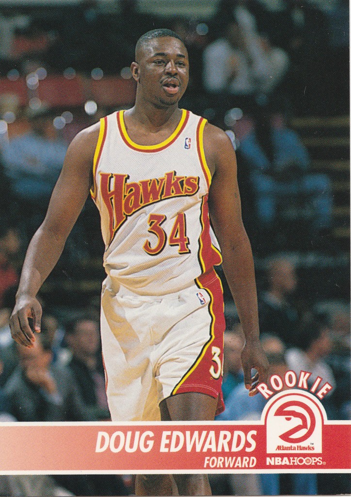
Looking at Doug Edwards’ stats – certainly not a 3-point shooter. I guess a good description of cluster 4 players might be … NBA caliber bench warmers.
看看道格·爱德华兹(Doug Edwards)的数据-当然不是三分球。 我想第4组球员的好描述可能是…NBA口径替补球员。
Cluster 4’s notable players include Yi Jianlian and Anthony Bennet….yeesh
第4组的知名球员包括易建联和安东尼·贝内特.... yeesh
|
| Outside Skills | 外在技能 | Rim Scoring | 轮滑得分 | Pure Points | 纯积分 | Defensive Big Man | 防守大个子 | Dead Eye | 死眼 | ||||||||
|---|---|---|---|---|---|---|---|---|---|---|---|---|---|---|---|---|---|
| 0.890984 | 0.890984 | 0.846109 | 0.846109 | -0.926444 | -0.926444 | 0.735306 | 0.735306 | -0.092395 | -0.092395 |
12 Adams, Michael 30 Alexander, Cory 41 Allen, Tony 62 Anderson, Kenny 65 Anderson, Mitchell 78 Anthony, Greg 90 Armstrong, Darrell 113 Bagley, John 126 Banks, Marcus 137 Barrett, Andre Name: Name, dtype: object12 Adams, Michael 30 Alexander, Cory 41 Allen, Tony 62 Anderson, Kenny 65 Anderson, Mitchell 78 Anthony, Greg 90 Armstrong, Darrell 113 Bagley, John 126 Banks, Marcus 137 Barrett, Andre Name: Name, dtype: object
Cluster 5 is magenta in the scatter matrix and includes 16% of players.
群集5在散布矩阵中为洋红色,包含16%的参与者。
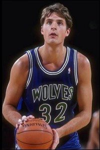
Cluster 5 players are highest in outside skills and second highest in rim scoring yet these players are dead last in pure points. It seems they score around the rim, but do not draw many fouls. They are second highest in defensive big man.
第5类球员的外部技能最高,篮下得分最高,但这些球员在纯积分上倒数第二。 看来他们在篮筐附近得分,但是并没有犯规。 他们在防守大个子中排名第二。
Gerald Henderson Sr is the prototype. Henderson is a good 3 point and free throw shooter but does not draw many fouls. He has lots of assists and steals.
Gerald Henderson Sr是原型。 亨德森是个不错的三分球罚球手,但是并没有犯规。 他有很多助攻和抢断。
Of interest mostly because it generates an error in my code, Gerald Henderson Jr is in cluster 2 – the mid range shooters.
有趣的主要是因为它在我的代码中生成错误,小杰拉德·亨德森(Jerald Henderson Jr)位于第2类–中距离射击游戏。
Notable cluster 5 players include Mugsy Bogues, MCW, Jeff Hornacek, Magic Johnson, Jason Kidd, Steve Nash, Rajon Rando, John Stockton. Lots of guards.
值得注意的5类玩家包括Mugsy Bogues,MCW,Jeff Hornacek,Magic Johnson,Jason Kidd,Steve Nash,Rajon Rando和John Stockton。 很多警卫。
In the cell below, I plot the percentage of players in each cluster.
在下面的单元格中,我绘制了每个群集中玩家的百分比。
|
I began this post by asking whether player positions is the most natural way to group NBA players. The clustering analysis here suggests not.
我在开始这篇文章时首先询问球员的位置是否是对NBA球员进行分组的最自然的方法。 这里的聚类分析表明不是。
Here’s my take on the clusters: Cluster 0 is pure shooters, Cluster 1 is talented scorers, Cluster 2 is mid-range shooters, Cluster 3 is defensive big-men, Cluster 4 is bench warmers, Cluster 5 is distributors. We might call the “positions” shooters, scorers, rim protectors, and distributors.
这是我对集群的看法:集群0是纯射手,集群1是有才华的得分手,集群2是中距离射手,集群3是防守大个子,集群4是替补球员,集群5是发行人。 我们可以称其为“位置”射手,得分手,篮框保护者和分发者。
It’s possible that our notion of position comes more from defensive performance than offensive. On defense, a player must have a particular size and agility to guard a particular opposing player. Because of this, a team will want a range of sizes and agility – strong men to defend the rim and quick men to defend agile ball carriers. Box scores are notoriously bad at describing defensive performance. This could account for the lack of “positions” in my cluster.
我们的位置观念有可能更多来自防守表现而非进攻。 在防守时,球员必须具有特定的身材和敏捷度,以防守特定的对位球员。 因此,一支球队需要各种尺寸和敏捷度-坚强的人防守篮筐,敏捷的人防守敏捷的球篮。 臭名昭著的禁区得分在描述防守表现方面很糟糕。 这可以解释我的集群中缺少“位置”的原因。
I did not include player height and weight in this analysis. I imagine height and weight might have made clusters that resemble the traditional positions. I chose to not include height and weight because these are player attributes; not player performance.
在此分析中,我没有包括球员的身高和体重。 我猜想身高和体重可能使群集类似于传统位置。 我选择不包括身高和体重,因为它们是球员属性。 不是球员的表现。
After looking through all the groups one thing that stands out to me is the lack of specialization. For example we did not find a single cluster of incredible 3-point shooters. Cluster 1 includes many great shooters, but it’s not populated exclusively by great shooters. It would be interesting if adding additional clusters to the analysis could find more specific clusters such as big-men that can shoot from the outside (e.g., Dirk) or high-volume scorers (e.g., Kobe).
在查看了所有组之后,对我而言突出的一件事是缺乏专业性。 例如,我们没有发现一个令人难以置信的三点射手集群。 群集1包含许多优秀射手,但并非仅由优秀射手组成。 如果将额外的聚类添加到分析中会发现更具体的聚类,例如可以从外面射击的大个子(例如Dirk)或得分高的得分手(例如Kobe),这将很有趣。
翻译自: https://www.pybloggers.com/2016/02/grouping-nba-players/
nba球员python